ShopDreamUp AI ArtDreamUp


Description
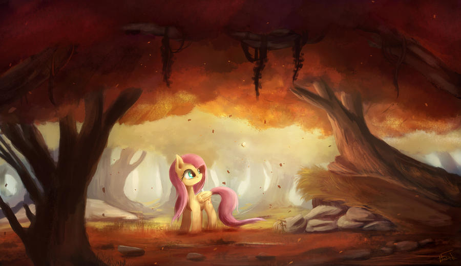
~the clearing at that forest
EDIT: Lowered the overall vividness to keep it more, uhh, realistic. Vividness, as in, the saturation of the colour. Able to maintain the values though, which is good.
Playing with bold colour and lighting. Started with B&W, but that stage didn't last long. I didn't know what was I going to draw, so I started splashing some colour on it.
Inspired by Blinck ([link])
An established and a professional artist. He really gives me quite a lot of inspiration on landscape. Do visit his dA and get your mind blown by his art. Go watch his videos on youtube(Blinckart) as well. There are some fine speedpaints video in there.
P.S. My sincerest apology for the previously missing credit.
---
lololdatglowingbutterflylolol
It's been almost 2 weeks, and my apology for the lack of regular weekly uploads. I'm being tied up currently with videos editing and some camp events.
---
Image size
1800x1042px 1.08 MB
© 2012 - 2024 aJVL
Comments162
Join the community to add your comment. Already a deviant? Log In
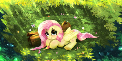
I really love the style you painted this in. It has such a nice soft look, with a touch of realism yet still keeping it My Little Pony style. The colors are one of the best parts of this, in my opinion. They are very fall colors and go well with each other. One thing I noticed, though, is that the trees and grass in the background are green, while the ones up front are orange and red colors. It may just be lighting, but it looks a bit like behind Fluttershy is spring and in front of her its fall. I also noticed one of the branches on the left tree looks too short. It still has a wonderful atmosphere though.
I love the setting. The ledge with the tree at the top is placed perfectly and is a nice touch. It could have maybe used an animal or too, though. I noticed that Fluttershys hair seems to be breezing behind her face, which is probably showing wind, yet her tail isn't flowing to the left. I also noticed she has no mouth, but I actually think the lack of it helps show her expression and isn't all that needed.
I think the shading is amazing and I like how the picture goes from dark to light. The focus is completely on Fluttershy, too, which is great.
Overall, I think this picture is gorgeous. Nothing really hinders this picture at all. The colors go perfectly together, and are beautiful colors too. Fluttershy looks adorable. I think you have a great painting skill and style. Everything blends well and helps the rest of the picture look even better. It looks like a lot of effort went into this picture!